Modal
-
Notification
-

Dmitriy Groshev
Hi, i am josephin. How are you...
17:123 -

Sufiya Elija
I need job, Please help me.
Fri32 -

Janis Evans
Good Morning!
8:2212 -

Mukrani Pabelo
Hi, i am josephin. How are you...
03:1410 -
Josephin Water
You’ve got some kind of a stom...
Thu2 -
Janis Evans
Good Morning!
8:2212 -
Sufiya Elija
I need job, Please help me.
Fri32
-
-
-
-
Cart Items(25)
-

Flower Pot
$25.00
-

Iphone Max pro
$35.20
-

Royal Party Glass
$45.10
-

Water Proof Watch
$12.30
-

Traveling Duffle Bag
$32.10
Proceed to CheckoutBag Total
$250.00 -
-
-
 English
  French
-
 Spanich
 -
 Arabic
-
-
Helen Walter
Admin
- General
- Components
- Applications
- Forms & Table
- Pages
- Miscellaneous
Modal
Use modal component to show interactive dialogs and notifications.
<!-- The button to open modal -->
   <div class="flex flex-wrap gap-2">
       <label class="button-label btn-primary" for="modal-1">Default Modal</label>
   </div>

<!-- Put this part before </body> tag for default modal -->
   <div>
      <input class="peer" name="modal-1" type="checkbox" id="modal-1">
      <label class="modal-overlay peer-checked:block" for="modal-1"></label>
      <div class="modal peer-checked:block w-[18.75rem]">
          <div class="modal-header">
              <h3>Hasten up !!</h3>
              <label class="modal-1">  <i class="w-4 h-4 stroke-dark"> </i> </label>
          </div>
          <div class="text-center modal-body">
              <p class="text-lg font-bold">Up to <span class="text-xl text-secondary"> 85% OFF </span> , Hurry Up Online Shopping </p>
              <div class="modal-img">
                   <img src="../../image.gif" alt="shopping"/ class="w-52">
              <div>
          </div>
          <label for="modal-1" class="px-2 py-1 text-white rounded bg-primary text-end" >Subscribe now</label>
      </div>
   </div>
Modal Sizes
Use different size of modal to show more information.
<!-- The button to open modal -->
   <div class="flex flex-col flex-wrap gap-2">
       <label class="button-label btn-secondary" for="modal-2">Small Modal</label>
       <label class="button-label btn-success" for="modal-3">Large Modal</label>
       <label class="button-label btn-warning" for="modal-4">Extralarge Modal</label>
   </div>

<!-- Put this part before </body> tag for small size modal -->
  <div>
      <input class="peer" name="modal-2" type="checkbox" id="modal-2">
      <label class="modal-overlay peer-checked:block" for="modal-2"></label>
      <div class="modal peer-checked:block w-[15.625rem]">
          <div class="modal-header">
              <h3>Web Design</h3>
              <label class="modal-2"> <i class="w-4 h-4 stroke-dark"> </i> </label>
          </div>
          <div class="modal-body h-[12.5rem]">
              <p>We build specialized websites for companies...</p>
          </div>
      </div>
  </div>

<!-- Put this part before </body> tag for large modal -->
  <div>
      <input type="checkbox" id="modal-3">
      <label class="modal-overlay peer-checked:block" for="modal-3"></label>
      <div class="w-11/12 modal peer-checked:block mzx-w-2xl">
          <div class="modal-header">
              <h3> Start with your goals</h3>
              <label class="modal-3"> <i class="w-4 h-4 stroke-dark"> </i> </label>
          </div>
          <div class="modal-body">
              <p>No matter how talented...</p>
              <ul class="mt-2">
                   <li class="flex items-center gap-2">
                       +SVG_ICON("Arrow-Right","w-[1.125rem] h-[1.125rem] stroke-title")
                        What must you achieve, and by when?
                   </li>
                   <li class="flex items-center gap-2">
                       +SVG_ICON("Arrow-Right","w-[1.125rem] h-[1.125rem] stroke-title")
                         How will you evaluate your level of success?
                   </li>
                   <li class="flex items-center gap-2">
                       +SVG_ICON("Arrow-Right","w-[1.125rem] h-[1.125rem] stroke-title")
                        Can you accomplish it with the available resources?
                   </li>
                   <li class="flex items-center gap-2">
                       +SVG_ICON("Arrow-Right","w-[1.125rem] h-[1.125rem] stroke-title")
                        Does it advance your core business aims?
                   </li>
              </ul>
          </div>
      </div>
  </div>

<!-- Put this part before </body> tag for extralarge modal -->
  <div>
      <input class="peer" name="modal-4" type="checkbox" id="modal-4">
      <label class="modal-overlay peer-checked:block" for="modal-4"></label>
      <div class="w-11/12 max-w-5xl modal peer-checked:block ">
          <div class="modal-header">
              <h3>congratulations !!</h3>
              <label class="modal-4"> <i class="w-4 h-4 stroke-dark"> </i> </label>
          </div>
          <div class="modal-body">
              <p>The capacity to comprehend and experience other...</p>
              <ul class="mt-2">
                   <li class="flex items-center gap-2">
                       +SVG_ICON("Arrow-Right","w-[1.125rem] h-[1.125rem] stroke-title")
                        What must you achieve, and by when?
                   </li>
                   <li class="flex items-center gap-2">
                       +SVG_ICON("Arrow-Right","w-[1.125rem] h-[1.125rem] stroke-title")
                         How will you evaluate your level of success?
                   </li>
                   <li class="flex items-center gap-2">
                       +SVG_ICON("Arrow-Right","w-[1.125rem] h-[1.125rem] stroke-title")
                        Can you accomplish it with the available resources?
                   </li>
                   <li class="flex items-center gap-2">
                       +SVG_ICON("Arrow-Right","w-[1.125rem] h-[1.125rem] stroke-title")
                        Does it advance your core business aims?
                   </li>
              </ul>
          </div>
      </div>
  </div>
Top Positions
To Set position top-left, top-center & top-right use .modal-top-left, .modal-top-center & .modal-top-right class.
<!-- The button to open modal -->
   <div class="flex flex-col flex-wrap gap-2">
       <label class="button-label btn-secondary" for="modal-10">Top Left Modal</label>
       <label class="button-label btn-warning" for="modal-11">Top Center Modal</label>
       <label class="button-label btn-success" for="modal-14">Top Right Modal</label>
   </div>

<!-- Put this part before </body> tag for top left position modal -->
   <div>
      <input class="peer" name="modal-10" type="checkbox" id="modal-10">
      <label class="modal-overlay peer-checked:block" for="modal-10"></label>
      <div class="modal modal-top-left peer-checked:block w-[18.75rem] sm:w-56">
          <div class="text-center modal-body">
              <ul class="modal-img">
                   <li class="flex items-center gap-2">
                       <img src="../../image.gif" alt="whatsapp" class="w-52"/>
                   </li>
                   <li class="flex items-center gap-2">
                       <img src="../../image.gif" alt="instagram" class="w-52"/>
                   </li>
                   <li class="flex items-center gap-2">
                       <img src="../../image.gif" alt="facebook" class="w-52"/>
                   </li>
              </ul>
              <p class="my-3" for="modal-10">Create an account</p>
              <label class="inline-block p-2 text-white btn btn-primary" for="modal-10">Create an account</label>
          </div>
      </div>
   </div>

<!-- Put this part before </body> tag for top center position modal -->
  <div>
     <input class="peer" name="modal-11" type="checkbox" id="modal-11">
     <label class="modal-overlay peer-checked:block" for="modal-11"></label>
     <div class="modal modal-top-center peer-checked:block w-[18.75rem] sm:w-56">
          <div class="text-center modal-body">
              <ul class="modal-img">
                   <li class="flex items-center gap-2">
                       <img src="../../image.gif" alt="whatsapp" class="w-52"/>
                   </li>
                   <li class="flex items-center gap-2">
                       <img src="../../image.gif" alt="instagram" class="w-52"/>
                   </li>
                   <li class="flex items-center gap-2">
                       <img src="../../image.gif" alt="facebook" class="w-52"/>
                   </li>
              </ul>
              <p class="my-3" for="modal-10">Create an account</p>
              <label class="inline-block p-2 text-white btn btn-primary" for="modal-11">Create an account</label>
          </div>
      </div>
  </div>

<!-- Put this part before </body> tag for top right position modal -->
  <div>
     <input class="peer" name="modal-14" type="checkbox" id="modal-14">
     <label class="modal-overlay peer-checked:block" for="modal-14"></label>
     <div class="modal modal-top-right peer-checked:block w-[18.75rem] sm:w-56">
          <div class="text-center modal-body">
              <ul class="modal-img">
                   <li class="flex items-center gap-2">
                       <img src="../../image.gif" alt="whatsapp" class="w-52"/>
                   </li>
                   <li class="flex items-center gap-2">
                       <img src="../../image.gif" alt="instagram" class="w-52"/>
                   </li>
                   <li class="flex items-center gap-2">
                       <img src="../../image.gif" alt="facebook" class="w-52"/>
                   </li>
              </ul>
              <p class="my-3" for="modal-10">Create an account</p>
              <label class="inline-block p-2 text-white btn btn-primary" for="modal-14">Create an account</label>
          </div>
      </div>
  </div>
Bottom Positions
Set position bottom-left bottom-center & bottom-right with the help of .modal-bottom-left, .modal-bottom-center & .modal-bottom-right class.
<!-- The button to open modal -->
   <div class="flex flex-col flex-wrap gap-2">
      <label class="button-label btn-info" for="modal-12">Bottom Left Modal</label>
      <label class="button-label btn-success" for="modal-13">Bottom Center Modal</label>
      <label class="button-label btn-success" for="modal-13">Bottom Right Modal</label>
   </div>

<!-- Put this part before </body> tag for bottom left position modal -->
  <div>
     <input class="peer" name="modal-12" type="checkbox" id="modal-12">
     <label class="modal-overlay peer-checked:block" for="modal-12"></label>
     <div class="modal modal-bottom-left peer-checked:block w-[18.75rem] sm:w-56">
          <div class="text-center modal-body">
              <div class="modal-img">
                   <img src="../../image.gif" alt="success"/ class="w-52">
              <div>
              <h3 class="mt-1 text-lg font-bold leading-none">Success Message</h3>
              <p class="mb-3">Now, you can access your account.</p>
              <label class="inline-block p-2 text-white btn btn-success" for="modal-12">Close</label>
          </div>
      </div>
  </div>

<!-- Put this part before </body> tag for bottom center position modal -->
  <div>
     <input class="peer" name="modal-13" type="checkbox" id="modal-13">
     <label class="modal-overlay peer-checked:block" for="modal-13"></label>
     <div class="modal modal-bottom-left peer-checked:block w-[18.75rem] sm:w-56">
          <div class="text-center modal-body">
              <div class="modal-img">
                   <img src="../../image.gif" alt="success"/ class="w-52">
              <div>
              <h3 class="mt-1 text-lg font-bold leading-none">Success Message</h3>
              <p class="mb-3">Now, you can access your account.</p>
              <label class="inline-block p-2 text-white btn btn-success" for="modal-13">Close</label>
          </div>
      </div>
  </div>

<!-- Put this part before </body> tag for bottom right position modal -->
  <div>
     <input class="peer" name="modal-15" type="checkbox" id="modal-15">
     <label class="modal-overlay peer-checked:block" for="modal-15"></label>
     <div class="modal modal-bottom-left peer-checked:block w-[18.75rem] sm:w-56">
          <div class="text-center modal-body">
              <div class="modal-img">
                   <img src="../../image.gif" alt="success"/ class="w-52">
              <div>
              <h3 class="mt-1 text-lg font-bold leading-none">Success Message</h3>
              <p class="mb-3">Now, you can access your account.</p>
              <label class="inline-block p-2 text-white btn btn-success" for="modal-15">Close</label>
          </div>
      </div>
  </div>
Centered Position
To set centered position use .modal-center class.
<!-- The button to open modal -->
    <div class="flex flex-col flex-wrap gap-2">
        <label class="button-label btn-success" for="modal-6">Centered Modal</label>
    </div>

<!-- Put this part before </body> tag for centered modal -->
  <div>
     <input class="peer" name="modal-6" type="checkbox" id="modal-6">
     <label class="modal-overlay peer-checked:block" for="modal-6"></label>
     <div class="modal modal-center peer-checked:block w-[18.75rem]">
          <div class="text-center modal-body">
              <div class="modal-img">
                   <img src="../../image.gif" alt="danger"/ class="w-52">
              <div>
              <h3 class="mt-1 text-lg font-bold leading-none">Ohh! Something went wrong!</h3>
              <p class="my-3">Attackers on malicious activity may...</p>
              <label class="inline-block p-2 text-white btn btn-danger" for="modal-6">Close</label>
          </div>
     </div>
 </div>
Modal Footer
Add footer in modal to create the modal-footer.
<!-- The button to open modal -->
   <div class="flex flex-col flex-wrap gap-2">
       <label class="button-label btn-secondary" for="modal-5">Footer Modal</label>
   </div>

<!-- Put this part before </body> tag for footer modal-->
    <div>
    <input class="peer" name="modal-5" type="checkbox" id="modal-5">
    <label class="modal-overlay peer-checked:block" for="modal-5"></label>
    <div class="modal w-[18.75rem] h-[18.75rem] peer-checked:block">
      <div class="modal-header">
        <h3>Cookies</h3>
        <label class="modal-5"> <i class="w-4 h-4 stroke-dark"> </i> </label>
      </div>
      <div class="modal-body h-[9.375rem]">
        <p>Accept the all cookies</p>
        <div class="modal-img">
                   <img src="../../image.gif" alt="cookie"/ class="w-52">
              <div>
      </div>
      <div class="modal-footer">
        <label class="inline-block p-2 text-white btn btn-primary" for="modal-5">Accept</label>
      </div>
    </div>
  </div>
Scrollable
Set the scrollable modal with the help of .modal-content-scroll class.
<!-- The button to open modal -->
  <div class="flex flex-col flex-wrap gap-2">
     <label class="button-label btn-info" for="modal-7">Scrollable Modal</label>
  </div>

<!-- Put this part before </body> tag for scrollable modal-->
  <div>
      <input class="peer" name="modal-7" type="checkbox" id="modal-7">
      <label class="modal-overlay peer-checked:block" for="modal-7"></label>
      <div class="modal peer-checked:block w-[18.75rem]">
          <div class="modal-header">
              <h3>Wed Designer</h3>
              <label class="modal-7"> <i class="w-4 h-4 stroke-dark"> </i> </label>
          </div>
          <div class="modal-body modal-content-scroll h-[25rem]">
              <div class="flex items-center gap-3">
                 +SVG_ICON("Arrow-Right","w-[1.125rem] h-[1.125rem] stroke-title")
                  <p>For a site to be successful, a designer must be able to communicate their ideas.</p>
              </div>
              <div class="flex items-center gap-3">
                 +SVG_ICON("Arrow-Right","w-[1.125rem] h-[1.125rem] stroke-title")
                  <p>Most businesses employ a certain font or typography so that clients can quickly distinguish them from their rivals.</p>
              </div>
              <div class="flex items-center gap-3">
                 +SVG_ICON("Arrow-Right","w-[1.125rem] h-[1.125rem] stroke-title")
                  <p>We build specialized websites for companies, list them on digital directories, and set up a sales funnel to boost ROI.</p>
              </div>
              <div class="flex items-center gap-3">
                 +SVG_ICON("Arrow-Right","w-[1.125rem] h-[1.125rem] stroke-title")
                  <p>Chat with a firm about what they want, and inquire about the target audience.</p>
              </div>
              <div class="flex items-center gap-3">
                 +SVG_ICON("Arrow-Right","w-[1.125rem] h-[1.125rem] stroke-title")
                  <p>firms may more easily and precisely communicate their brands through typography.</p>
              </div>
          </div>
          <div class="modal-footer">
              <label  class="inline-block p-2 text-white btn btn-primary" for="modal-7">Close</button >
          </div>
      </div>
  </div>
Form Element
Add the form element inside the modal content.
<!-- The button toLogin open modal -->
  <div class="flex flex-col flex-wrap gap-2">
     <label class="button-label btn-warning" for="modal-8">Login Form</label>
  </div>

<!-- Put this part before </body> tag for form modal-->
  <div>
      <input class="peer" name="modal-8" type="checkbox" id="modal-8">
      <label class="modal-overlay peer-checked:block" for="modal-8"></label>
      <div class="max-w-sm modal peer-checked:block">
          <div class="modal-body">
              <form class="flex flex-col gap-3 theme-form">
                  <h3>Govo Account</h3>
                  <p>Hello, enter your email id and password for log in to your account</p>
                  <div> <input type="email" placeholder="Enter your id.."class="bg-sidebar-dark" required> </div>
                  <div> <input type="password" placeholder="Password.." class="bg-sidebar-dark" required> </div>
                  <div class="flex items-center justify-between gap-1">
                      <div class="flex items-center gap-2 !mb-0">
                          <input type="checkbox" id="checkbox-1">
                          <label for=checkbox-1 class="!text-content !text-xs"> Remember me </label>
                      </div>
                      <div class="!mb-0"><a href="/forgot-password"> Forgot Password? </a> </div>
                  </div>
                  <div> <h4> Or Sign in with </h4> </div>
                  <div class="social">
                      <a href="https://www.linkedin.com/login" class="btn flex gap-1 justify-center items-center>
                          <img src="../../image.svg" alt="linkedin"/> Linkedin </a>
                      <a href="https://twitter.com/i/flow/login" class="btn flex gap-1 justify-center items-center>
                          <img src="../../image.svg" alt="twitter"/> Twitter </a>
                      <a href="https://www.facebook.com/" class="btn flex gap-1 justify-center items-center>
                          <img src="../../image.svg" alt="facebook"/> Facebook </a>
                  </div>
                  <div class="text-center">
                      <span> Don't have an account? <small class="cursor-pointer"> Create Now </small> </span>
                  </div>
              </form>
          </div>
      </div>
  </div>
Tooltip
Add tooltip inside the modal.
<!-- The button to open modal for tooltips & popover modal-->
  <div class="flex flex-col flex-wrap gap-2">
     <label class="button-label btn-success" for="modal-9">Modal</label>
  </div>
<!-- Put this part before </body> tag -->
  <div>
      <input class="peer" name="modal-9" type="checkbox" id="modal-9">
      <label class="modal-overlay peer-checked:block" for="modal-9"></label>
      <div class="modal w-[18.75rem]" peer-checked:block>
          <div class="modal-header">
              <h3>Modal Title</h3>
              <label class="modal-9"> <i class="w-4 h-4 stroke-dark"> </i> </label>
          </div>
          <div class="modal-body">
              <p>Content for the modal</p>
          </div>
      </div>
</div> Hasten up !
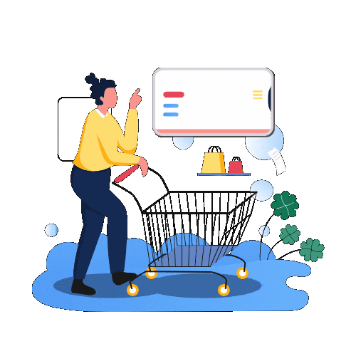
Up to 85% OFF , Hurry Up Online Shopping
Cookies
This website uses cookies to ensure you get the best experience on our website.
Ohh! Something went wrong!
Attackers on malicious activity may trick you into doing something dangerous like installing software or revealing your personal information.


Remove your complete account from your phone or tablet to sign out of the Gmail app.
Remove your complete account from your phone or tablet to sign out of the Gmail app.
Remove your complete account from your phone or tablet to sign out of the Gmail app.

Success Message
Now, you can access your account.
Success Message
Now, you can access your account.
Success Message
Now, you can access your account.